Many people undervalue the idea of having a premium business card when they’re trying to advance their professional careers or make sales. It is essential to have a business card design that correctly represents the image you want your company or personal brand to stand for.
Think of your card as the one tie this potential customer will have with your company. You want them to remember you, not discard you. Therefore, there are different stylistic avenues that people should take when trying to design the perfect card. Each business is different, which means each company should have a unique design too. Below are some helpful business card design tips you should keep in mind during the design process.

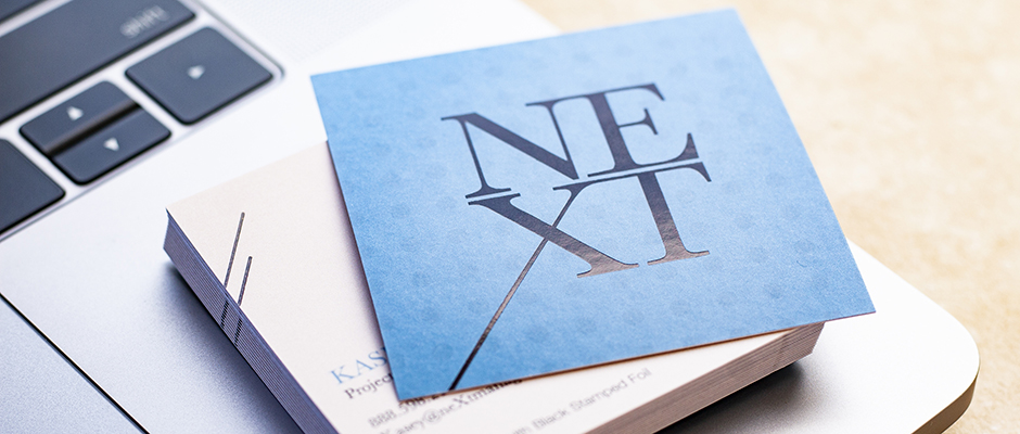
Business Card Design: Keep It Simple
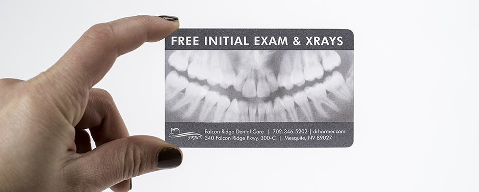
Remember the saying from the 5th grade, “KISS”? (Keep it simple silly.) Well, that philosophy applies here too. Stick to the bare minimum of information. Doing this is useful for two reasons. It makes your card easier to read and it makes the information on your card much easier to remember.
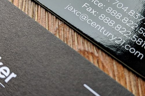
What phone number do you actually want people to reach you on? Most of the time it isn’t necessary to include your cell, office, direct line, and fax number all on one card. Pick the one that is the most important and remove the others. Having too many phone numbers can be confusing and could result in moving on to someone else.
Another thing to think about is social media icons. Just placing the symbols by themselves is usually enough to tell people where to find you on social. It isn’t necessary to type out all of your handles for each site. Just seeing the icon tells people you are on Twitter, so they can enter your name into the search to find you easily, without cluttering up your card.
Do you want people to show up at your business? With most businesses being handled online and many employees working remotely, if you do not want people to physically come by your office, take the address off your card. This will also clean up the clutter and save room on the card.
Lastly, try to stick to one, or maybe two fonts. Putting any more than that will make them hard to read and will look too busy. Fonts should be simple. Avoiding stylized fonts and scrips will make the information much more clear.
Business Card Sizes
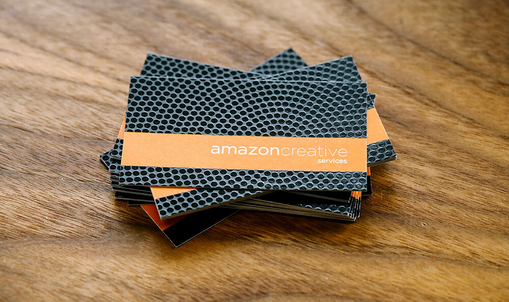
What is the standard business card size? When people think of sizes, there is a typical size that comes to mind: 3.5″ x 2”. Why not make your card stand out among their stack with an unusual size? The European size is growing in popularity in the United States (3.375” x 1.125″) or try a square card. We can print 2″ x 2″ business cards or even 2.5″ x 2.5″ – both options help you to be a little different than the competition. Selecting the best business card size can help create a great impression.
Utilize your Space
People make the mistake of putting a lot of additional information all on one side when in truth, a two-sided card is sometimes the same price as a one-sided card, so why not use it? I always think of the second side as a book cover. It gives you a little taste of what you will find on the other side. Even if you only include your logo, it’s an excellent way to introduce yourself. If you have a lot of contact information that needs to be added on the other side, maybe separate it out by putting your web address &/or physical address with the logo on one side.

And if your logo is significant on the one side, you can either exclude it or make it much smaller on the contact information side. This will help free up space and make the card less cluttered.
Match Your Paper To Your Business Card Design
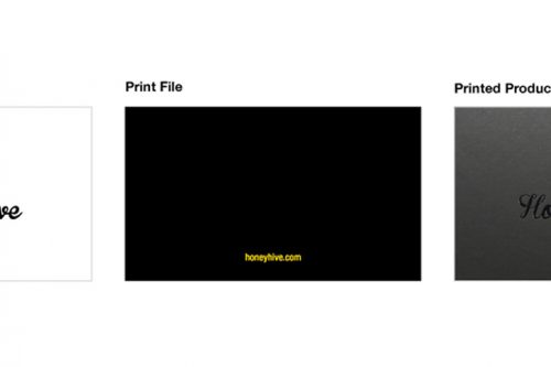
Not sure which stock to select? It can be challenging as there is a lot of different stock to choose from. Each one is unique and can help tell your story; so, pick one that best fits your business. If you are an organic snack company, I wouldn’t recommend you order a plastic or glossy card. Go for an uncoated paper, such as The ModCard, painted edge business card, or linen. These papers will help sell the natural, organic feeling you represent. Learn more about which card stock is best for your print job; Everything You Need To Know About Primoprint Papers.
We had a design customer that sold windows screens, and he chose a 20PT frosted plastic card. The card type was perfect for him because it reinforced the idea of light shining through his screens. A clothing company may want to look at the velvet laminated cards because this soft-touch card can remind someone how their fabric may feel.
With so many different options, you can appeal to the senses of touch and sight at the same time. The above are four great ways to ensure that you have a practical and professional-looking card. The main things to adhere to are using the right size for you and your business and not overdoing the design. Designing your business cards can be tricky. A simple card with minimal information is much more effective than one that offers an abundance of information.
Still, have questions about your design? Feel free to contact us. We also have on-staff designers that can assist in getting you the perfect design. To get started and learn more about our design services, please click here. Or to see samples of their work, make sure to check out their design portfolio.