We demand a lot from logos. Logos have to be simple while conveying the brand’s ethos so that it resonates with their consumers. In addition to being timeless and distinct, they must still be modern and follow contemporary graphic designs.
Below are three of the most famous rebrands from 2016.
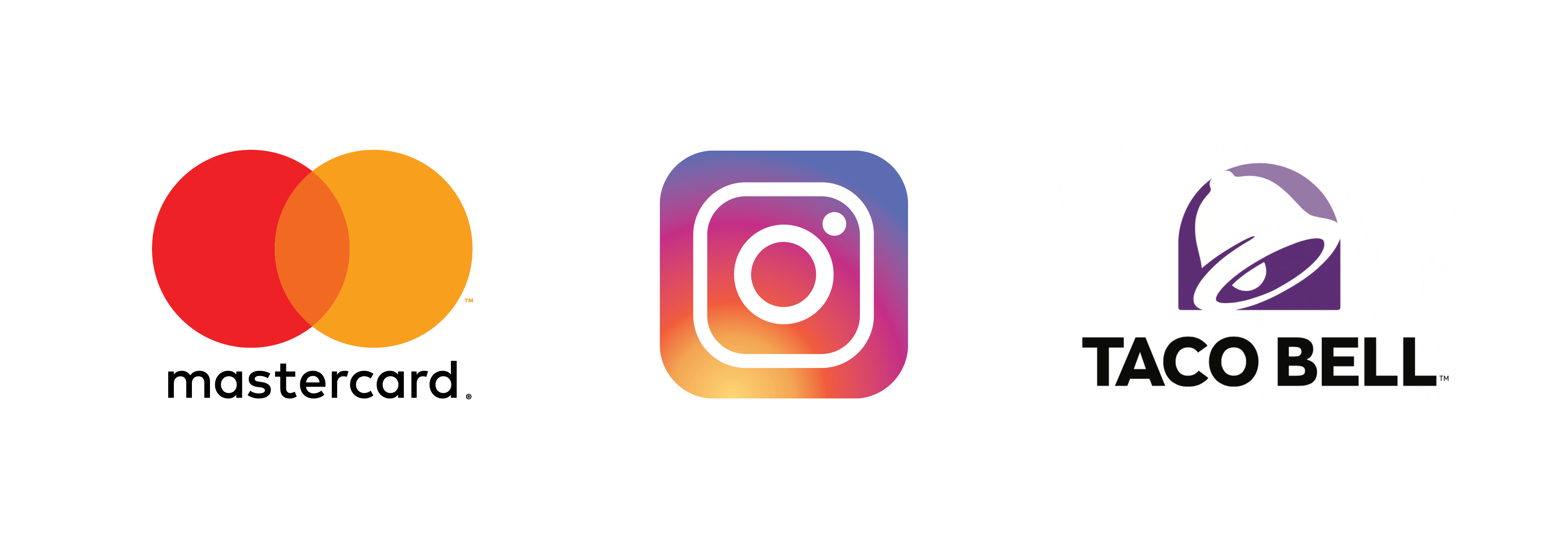
Simplification: MASTERCARD
One big trend this year is logo simplification. Pressure from social media,
While the logo’s interlocking circles remain, the horizontal lines framing the word “Mastercard” and sitting in the overlap have been removed and replaced by an orange shade, the result of mixing primary colors yellow and red. The combination strives to cement “connectivity” and “seamlessness,” one of the company’s key brand messages.
Following the rebrand, research conducted by Mastercard showed that more than 80% of consumers still recognized the symbol without the inclusion of the name.
Negative Space: INSTAGRAM

Negative Space can provide a memorable way of calling to attention a company’s attributes. While Instagram kept its camera icon, it switched from a retro three-dimensional design to a flat, minimalist design. The use of negative space is critical in their new design, as it outlines the camera lens and flashes against the rainbow gradient.
Clean Lines: TACO BELL
As companies are leaning more towards simplification, one of the first things to go has been and textures. First, larger businesses are opting for logos with clean, simple lines, as this makes building signage more accessible and more cost-effective.
Taco Bell’s designers opted to pare down the logo, replacing its magenta, purple and yellow with a regal purple with subtle gradient shading. It utilizes white space to shape the bell.
Think your brand could use a refresh? Our design team would be happy to assist you in creating a new modern identity for your business. For more information, complete our graphic design form.