Sometimes it is not the message, but how it is said, that makes the most impact. The message will be rendered useless if the intended receiver has no desire to hear and/or read it. In printed communication, the design matters a lot from the logo to the colors down to the font choice in making an impact on the target audience. Sometimes, there is a limited amount of time for them to see the design. To illustrate, a billboard on the highway is often bypassed by cars in literally a matter of seconds, so it must get its job done swiftly and effectively.
Affordable marketing strategies include printed materials as a way of advertising a product or a service. Companies who rely on print advertising need to have an excellent eye-catching design that will attract attention. From small materials like printed fliers, brochures, menus, and business cards, they need to be memorable. For large scale items, these printed materials must be visible and readable even from great distances. Knowing what to do can help you maximize your print material.
Here are some tips on how to pick a font for your print project:
Think of the Mood
The first question to think about is what mood or ambiance you are trying to create with your project. The way to answer this would be to see who your target audience is because they are the reason you are crafting the message. Think about the feelings you want to evoke when they see your final layout. In business, customized design with the use of fonts to name your brand will, of course, help you set yourself apart from your competitors. Imagine—you and your competitor both sell perfumes. What kind of typeface will you utilize in your design to drive the customers into your store and not the other ones? Your visual signs have the capability of catching the eyes, and they have the power to give the vibe of your business in a matter of seconds.
Visual and Tonal Considerations
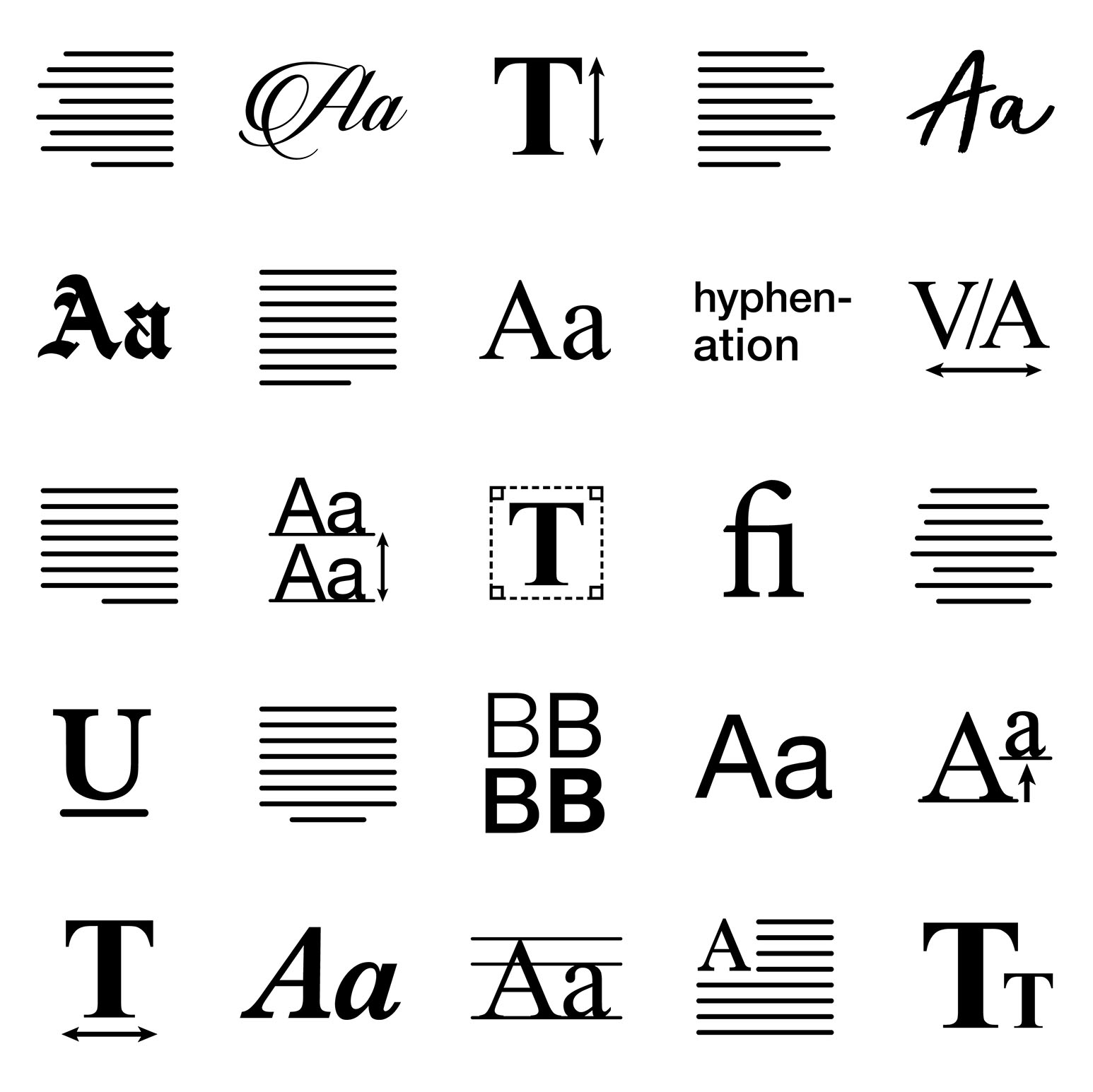
Strongly related to the previous category are the visual cues and the tones the fonts evoke. The visual aspect is how the font looks. The tonal component refers to how the words are arranged to form the exact message. These two elements need to work together and balance each other.
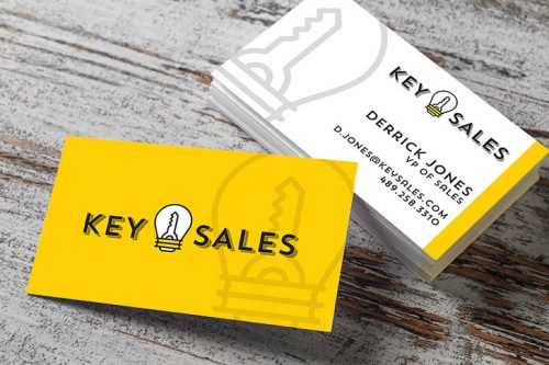
If you’re using several font types in a project such as a poster, you have to be careful to harmonize all the elements to make them visually satisfying. Do you want it to be rounded with swirls with a feminine feel to it? Or perhaps a more angular design in big, bold letters is the best choice. As an example, a wedding invitation may go for an old school engraved type font, but when designing a business card, you’ll want it to look more professional with sleek, robust, and angular letters.
Functionality and Readability
The form is not the only important thing, but function, too. Perhaps thinking about what it will be used for is even more significant than the form. Is it going to be for a billboard? Then the size of the fonts must be large enough, and the wording should be simplified because time is of the essence in reading big signs like that. Other affordable marketing strategies like fliers or brochures have a different purpose so you can add more font types, sizes, and words. Unlike billboards, brochures and flyers contain even more information so playing around with font styles, colors, layout, and size can help to draw the eye longer so that the audience will be enticed to read all the information contained in the printed materials.
A Little Can Go Along Way
The beauty of having a wide array of font styles to choose from is that you can select one that packs the most impact. Sometimes, simple is the best, and you do not have to be wordy. Simply choosing the right font is enough to make people pay attention to. Some playful fonts such as Santa Claus or the Joker exude enough personality to make things work. Other times, it is a combination of font and color. Think of all the “danger” and “warning” signs out there. Imagine how such a simple, single word can be enough to keep people from being careless.
Variety Eases Boredom
With many different kinds of fonts to choose from, it is unlikely that you will stick to one design for your print project. Choosing two or three font styles are normal because you don’t want the project to get too uniform. There is a risk of things becoming dull if they are too similar. Additionally, you also don’t want it to look overwhelming. If you are using more than one typeface, it is crucial to consider if you are aiming for harmony or contrast. The complementary font has its purpose in spreading an overall general feeling, which is what you want to achieve when branding something.
Test Rigorously
It is always vital to make a prototype of any project you create. Sometimes, the fonts look fantastic when you have rendered it on your computer. However, when you print it out, all the words fall flat and without a hint of personality. Thus, it is important always to test if what you’ve designed is relevant for your project. Check physically to see if the font is the right size, if there is enough spacing between the letters, is the justification on point, do the fonts work with the other elements on the material, and so on.
It is essential to have a realistic idea of how it will end up looking so making a mini prototype is never a bad idea. On top of that, you also have to consider the performance. Some fonts take a different format when rendered for web use. So before you get started in a project, make sure the fonts you use are web safe.
In the end, picking a font style or a typeface will depend on your understanding of the project and your intuition of what feels and looks right. After all, this is an art that relies so heavily on the designer’s judgment. And as with any project, choosing the font, combining with other elements, and making a layout demands practice because as the cliché goes, practice does make perfect.
Was this article helpful? Do you have a suggestion or a favorite font that you would like to mention? Let us know by leaving a comment.
