Your business card is an extension of you and your brand. It’s often overlooked, but they have an essential job to do, and your business card design is what helps it get the job done. Having a well-designed custom business card can make you look reputable to potential customers. It lets them know that you are a respectable company that can help them with your services and/or products.
Digitally swapping contact information is often viewed as impersonal. So, we want to make sure that your card represents you and your business!
Before you start your business card design, we’ve listed common mistakes that should be avoided during the design process.
Common Business Card Mistakes:
- Leaving Out Contact Information
- Outdated Information
- Misprints and Typos
- Image Quality
- Poor-Quality Card Stock
- Typography Mistakes
- Not Including Value
- Lack of Branding
- Visual Clutter
- Not Utilizing the Back of the Card
- Cut Line, Bleed, and Safe Area
The standard business card size is 2″ x 3.5″, which isn’t a lot of space to sell yourself. So, it’s essential to use the area wisely to grab the attention of the person receiving the card. A poorly-designed and unprofessional-looking card can drive away customers that genuinely need your products or services.
Leaving Out Contact Information
We all know that a business card is small in size. Still, it continues to be a useful and powerful marketing tool allowing you to connect with prospects, customers, or clients, fellow business owners, all while promoting your brand.
Before you start visualizing the details of your new business card design, (colors, text, features, etc.) make sure you consider including the most crucial information:
- Full Company Name
- Your Name
- Title/Specialization or Job Title
- Company Address (If you have a physical location to visit)
- Website
- Email Contact
- Phone Number
- Social Media Handles
Tip: Only include the social media handles that you and your company are business-related active on. Customers love having various ways to communicate with a business.
Outdated Information
If you were handed a business card that had an outdated email address, would you consider them reputable? What about if they had crossed out specific information on the card and re-written it in ink? What impression does that give to clients or prospects?
Business cards are incredibly affordable. Don’t be afraid to recycle old cards that have outdated information on them and order new ones.
Misprints and Typos
Grammatical errors and typos tell your customers that you don’t care about the details of how you run your business. Of course, everyone makes an occasional mistake. But it’s a reasonable expectation for a customer to expect that you proofread your business cards before handing them out.
A recent study found that 42.5% of users reported they would be influenced not to purchase goods or services by spelling mistakes.
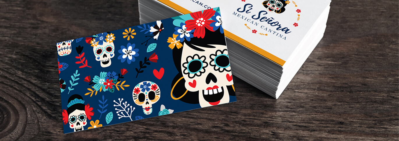
Image Quality
Avoid poor picture quality as well. Use hi-res images that don’t end up pixelated or blurry on your final design. To get a better understanding of the quality of images, we’ve described the importance of 300dpi photos.

Poor-Quality Card Stock
It’s crucial to select the appropriate card stock. Sure, a card can have a fantastic design and purpose. But, once they are in the hands of the recipients, you’ll want to make sure they aren’t feather-light and flimsy. By having a poor quality business card can imply that you and your business will have poor products and services. We recommend the following: Silk Laminated, Velvet Laminated, Painted Edge Cards, and our 22PT Gloss Laminates cards. You can even select Plastic business cards.
Primo Tip: Try no to skimp on money when it comes to your business cards. Keep in mind that a business card is an extension of you and your business. Choose premium paper and make them count!
Unreadable Text or Tiny Print
No matter how good of a design, if your customer can’t read the print on the card, it’s pretty much unusable. Avoid using hard-to-read typography on your card. Trying to be too creative can end up being a curse when your customers are unable to read the words. Also, make sure you experiment with the font size. For example, if you have an older demographic, make sure to use simplified, larger text. Make sure to avoid using small fonts to fit in more information.
Learn about the importance of structuring an effective typographic hierarchy.
Is There a Value?
Why should your prospect hire you? What value will you bring to them, or what problems can you help resolve? Sometimes, the answer to this is obvious. If you’re a plumber, a simple statement like, “The most experienced plumbing professional in a three-county radius” is an easy value proposition.
If you solve a more complex problem, your design must describe the values you can bring to the customer. Providing a solid value proposition is your best opportunity to connect with the people who view your card.
Lack of Branding
Building your brand story is important. If you’re looking to make a forgettable impression, play it safe, and use highly generic visuals on your card. If you want a prospect to remember you, use the distinctive branding that makes you stand out from your competitors.
Your design should include the same colors used for your business logo and website. When you properly brand your business card, you build recognition and encourage customers to associate you with the products or services they need.
Visual Clutter
When thinking about the images, graphics, patterns, and text, make sure the design isn’t too busy. Not only can it look cluttered, but your information can also get lost.
If you’re using three or four images on your card, it’s probably too much. And if you find yourself overlapping images with text, this also can be too much.
Having sufficient white space helps the recipients to focus on the information rather than the design. Visual clutter can cause viewers to give up and move on.
Not Utilizing the Back of the Card
Often, the back of the business card is forgotten or overlooked in the design process. Skipping to use the back of your card is a missed opportunity to include additional information. Whether it’s a business slogan, social media accounts, product statistics, QR Code, inspirational quote, or special coupon, there are plenty of creative ways to use the back to create a positive and long-lasting impression.
Cut Line, Bleed, and Safe Area
So, you have the design all ready to go. Before unleashing your creativity, you must pay attention to the following: bleed, cut line, and safe area. Not only are they essential for your business card design, but they also play an important role in any print product.

We’ve created a video tutorial that will help you by making sure you start with correct dimensions, including bleed and the proper CMYK color mode. We’ll also provide you with the guidelines needed to make sure you meet our production requirements, ensuring you with the best print product available.
Resource: What is the Difference; CMYK vs. RGB
Need Help with a Custom Card Design
If you need help with a custom design, re-branding, or logo design, our in-house design team will be happy to help. Learn more about our design service and make sure you take a look at some of their previous work by visiting the design gallery.
Do you have any suggestions on what not to put on your business card? We would love to know, please let us know by leaving a comment below.