Big names like Apple and Airbnb made Living Coral a key part of their color palettes and Pantone was quick to notice. Step aside millennial pink- there’s a new pink hue dominating the designs and art in 2019.
What Living Coral is Saying to Us
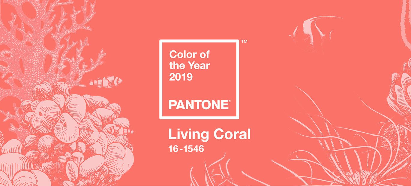
Living Coral, or Pantone 16-1546, is an optimistic blend of peach and gold with a pink hue that shows up more in the natural world than in Pantone’s rendition. This color choice seems to bring with it a revival of hope, energy, and life.
Pantone’s choice for 2018 was UltraViolet, a color that starkly contrasts with the upbeat Living Coral color of 2019.
While the deep purple tones of yesteryear seem to keep us suspended in a dreamy twilight, Living Coral brings us into the bright sunrise of vibrant connection.
Many people have been feeling lost in their own heads. They are searching for an outlet for their emotional and creative endeavors. Living Coral symbolizes the safe space in which that can occur. Pantone’s experts search the creative realm far and wide for hints about which color is worthy of the “Color of the Year” title.
From fashion to film, Pantone wants to know which color is having the most impact on the public. Laurie Pressman speaks on the company’s quest for the 2019 color, “A global team of color experts combs the world looking for new color influences…” When it comes to being sure of a new color of the year, Pantone doesn’t leave any stone unturned.
When it comes to being sure of a new color of the year, Pantone doesn’t leave any stone unturned. – Laurie Pressman
Living Coral embodies what so many people are searching for in our current culture. They are looking for a glimmer of hope, a sign that everything is going to work out, and an affirming nod to let them know that their dreams are worth pursuing.
Where to Expect Living Coral to Make an Appearance
The most common frontier to expect this vibrant hue is on the home front. Wallpaper, paint, trim, pillows, and everything in between can be found in this color.
Living Coral has a way of being applicable across many home decor styles, not just beach-themed spaces. Whether you want to add pops of color to a sleek, black and white room or go all out with bright, coral walls, Pantone 16-1546 doesn’t disappoint.
The possibilities for this color are truly endless. Its welcoming aura speaks volumes in small pops but isn’t overwhelming on a large scale. You can make it the main attraction of your living room, add pops of happiness to your bathroom, or liven up your bedroom with this buoyant tint.
Even appliances are popping up in shades very similar to Living Coral. It’s part of the retro muse that seems to be sweeping cookware and kitchen essentials recently. It’s no coincidence that it pairs so well with the retro turquoise color that seems to be growing in popularity for kitchenware.
The “Traditional Hotel Experience”
It’s nice to think that color so symbolic of connection could be the start of a brand-new partnership. Pantone and Tribute Portfolio have come together to create the Pantone Pantry by Tribute Portfolio at Art Basel Miami.
They have also teamed up with Adobe Stock to deliver Living Coral-splashed images to designers who are ready to incorporate it into their concepts.

How do you plan to incorporate this lively shade into your projects this year? Whether you’re adding it to your home decor, print designs, print marketing materials, website, Living Coral will certainly be uplifting and inspiring for longer than 365 days.