
Business cards play an important role in business. When meeting new people, it is expected for an individual to have a business card to promote future contact. Not only are they a cost-effective way to market yourself or your business, but they also build brand awareness.
When creating a business card here are some “do’s” and “don’ts” to follow:
Do’s
READABILITY:
Everyone loves fancy fonts. But while creating a business card you want to stay away from the fancy, twirly, and cruise fonts. Stick with simple, clean Serif or Sans Serif fonts. Also, keep in mind that color makes a huge impact on readability. Lighter backgrounds with lighter color text are very hard to read, as well as dark backgrounds with dark text. Try to use contrasting dark and light colors to ensure the text will stand out more.
CORRECT INFORMATION
You would be surprised how many business cards have incorrect or outdated information. It happens all the time. Be sure to proofread your card carefully before printing. One of the best practices for proofreading is to read right to left. If any information on your business cards change, be sure to print new cards as soon as possible. Never cross out text and handwrite the new information on it. It’s not a good look.
Cards should contain: Logo, Name, Job title, Phone number, Email address, and Website
Optional Info: Social Media Icons, Tagline, Physical Address, QR Code
BACK OF CARD
When printing your cards, why not optimize all the space available. It’s important not to clutter your card, so while it’s highly recommended to print on the back of the card, you still want to keep it clean and simple.
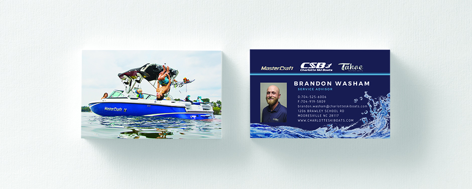
I like to think of the back of the card as a book cover. It’s a nice visual that leads you over to the flip side of the card. For example, we have a customer who sells speed boats. On the back of their card, they have a great picture of someone jumping off the side of the boat.
Some companies may use the company icon and make the back more decorative. Or, placing your logo on the back of the card is a great way to make more room on the front. If you have it on the back, you really don’t need to repeat it on the front.
Other ideas include appointment reminders, a shortlist of services, or your company slogan.
STICK TO YOUR BRAND
Your brand is your identity in the marketing world. It sets you aside from your competitors and should be consistent across all platforms – such as your website, marketing materials, and in-store appearance. Keeping consistent with your branded colors, fonts, and graphics is very important to brand recognition and awareness.
HIRE A DESIGNER
They say first impressions are last impressions. Hiring a graphic designer is a great idea if you don’t have a creative side. A designer will know all the do’s and don’ts when it comes to design. Let the pros handle it and you will make a lasting impression. (Check out the Primoprint Design Team HERE.)
Don’ts
CHEAP CARD STOCK
Never print from a home or office computer. You can purchase business cards pretty inexpensively online – almost for the same price as buying the print-yourself paper, and the quality will be 100% better. Primoprint offers 16 types of business card stocks and can even mail you a free sample pack so you can see and feel the paper before ordering.
CLIP ART / COMPUTER IMAGES
Your computer offers a large variety of free images and art. But remember everyone with a computer also has those same images. Stand out by purchasing an image that is unique to your brand. Sites like iStock and Shutterstock offer a huge selection of stock photography. Or, you can even find some good sites online offering free images
PROOFREAD
Proofread, proofread, proofread. And then have someone else proofread. It’s so easy to look over your contact information and miss an error. So make sure you get a different set of eyes to glance over the artwork before sending to print. You definitely don’t want to invest in business cards and then need to throw them out because the information is wrong.
PROVIDE TOO MUCH INFORMATION
Providing too much information can distract a reader and block out important information such as your phone number and email address. Remember white space is good, more is even better. Whitespace not only makes your card look clean and organized, but it also can direct the viewer’s eye to the correct information. If you list too many phone numbers, for example, it can be confusing as to where you actually want the customer to call. Only list the number that you want people to use.
If you need help creating your business card don’t worry. Our in-house graphic design team is here to help your business grow – and to get your information out effectively and affordably! Reach out to us today to get started!