Design Project: Custom Logo Design
Primoprint Designer: Kelly
Background
The client came to us in need of a new logo. They are a full-scope construction, project management, engineering design, and property development company. Their logo needed to represent who they are and their Pacific Northwest location.
“We are based out of the Puget Sound, surrounded by the Cascades and Olympic Mountain Ranges. Mt. Rainier is visible from most of the Olympia area. Evergreens grow in abundance. We would like to incorporate these elements into our company logo.”
Meet Our Designer: Kelly Alexander
Graphic Design Process
I got started on their logo and created three initial concepts.
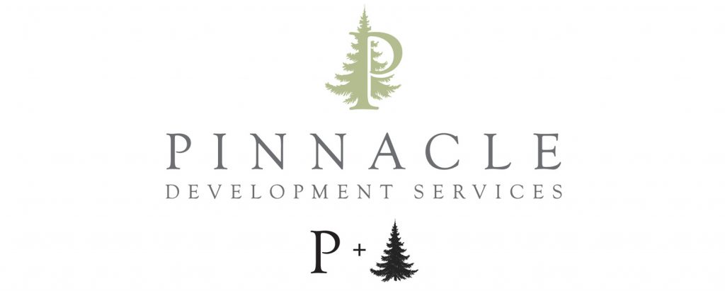
Logo Design Concept #1
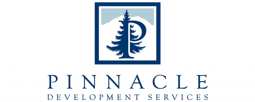
The first incorporated the letter “P” with an evergreen tree to reflect their location in the Pacific Northwest and their focus on growth and development. My goal was to provide a versatile and timeless icon paired with a typeface that felt both sophisticated and fresh.
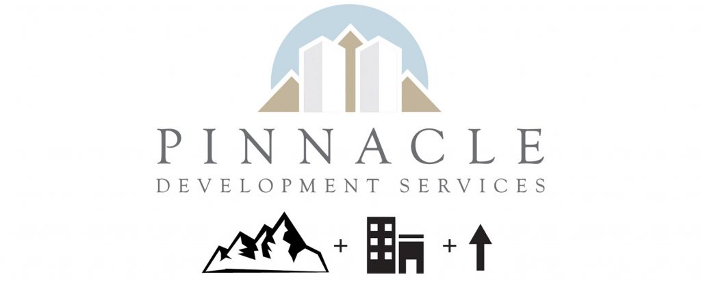
Logo Design Concept #2
The second concept tied together the mountain range, tall buildings (alluding to both commercial or apartment building development), and an up-arrow hidden in the negative space as a nod to the company name, Pinnacle, which means the highest point. I played down the sharp angles and modern feel of this icon by using subtle nature-based colors and the same sophisticated typeface.
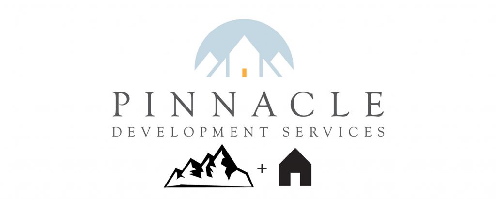
Logo Design Concept #3
The last concept we provided focused more on the residential aspect of the development services since this is a division of their services that they seemed eager to expand in the next 5-10 years. Much like option 2, I incorporated a mountain range, this time with a simple house icon. I used negative space to create the shapes and add interest, and chose unexpected orange for a splash of color on the door.
The client opted to go with the tree concept but wanted to include some additional design elements. After some conversation and examples, the client decided to keep it simple. I explained the benefit of keeping a logo clean and simple, reminding them that they could incorporate additional imagery and colors into the rest of their branding.
The goal is to create an immediately recognizable icon that works, whether it is on a billboard or a business card. When we start dealing with gradients, layers of content, shadows, etc. the impact of the actual concept can be compromised, especially when printed or displayed small.
“I am so thankful you took the time to explain the process and keep us on track and how to think about the logo design. It makes sense keeping it simple for just the logo.”
After a few more small tweaks, the logo was complete!
Lastly, I worked with Pinnacle on their business card design. The client decided to print on the 32PT Painted Edge paper with the Pearlescent Gold edge. They applied the logo with a blue stamped foil to the front. The entire project turned out beautifully!
Do you need help with a custom logo or looking to revamp your current logo? We can help, let us know.
