Each year Pantone announces what they call “Pantone Color of the Year.” This is a color that they feel represents the world in which we are headed. It tends to help set trends and companies from around the world integrate it into their marketing material. This year, we at Primoprint, have tasked each of our designers with coming up with their personal “color of the year.” This is a color that the designer feels will be trendy and make a statement in 2022.
JOHNNY: 30, 24, 33, 0
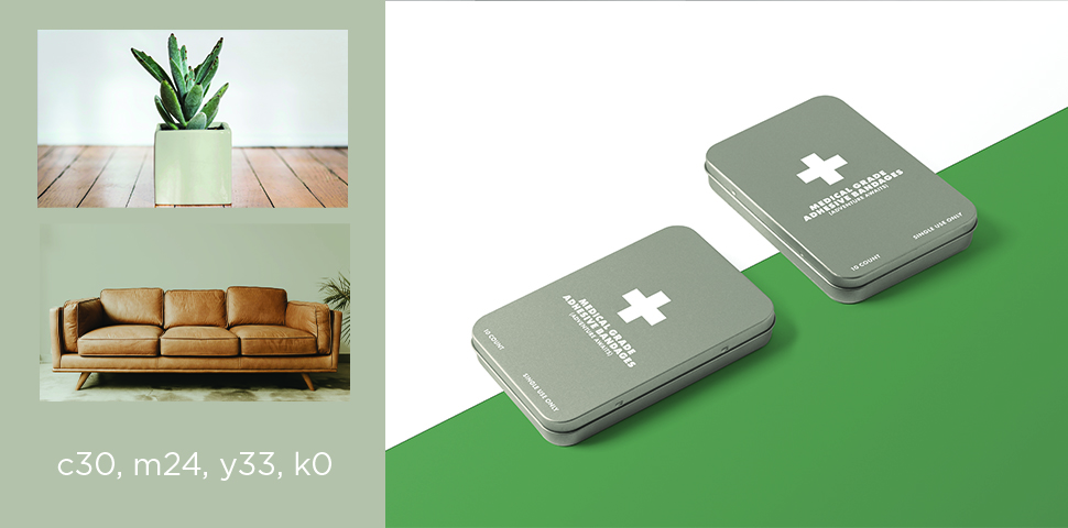
“As we move into 2022 and the world slowly begins to open again, I believe we’ll be seeing more neutral, muted colors to symbolize personal growth and creativity. This earthy, organic color reflects both quiet, personal growth and the need for adventure. Colors such as this one will be found in interior decorating, print design, and fashion.”
-Johnny
KELLY: 50, 30, 34, 0
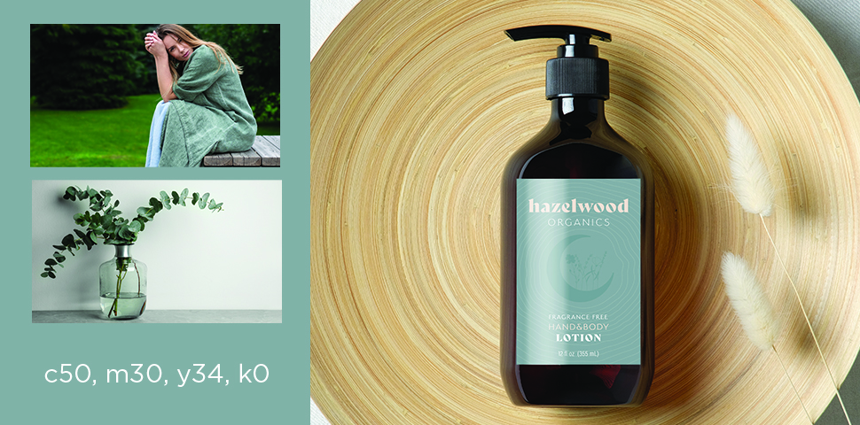
“I think this color is both strong and calm. It’s interesting enough to stand on its own and neutral enough to be an unexpected backdrop to brighter colors.” – Kelly
BROOKE: 57, 33, 49, 6
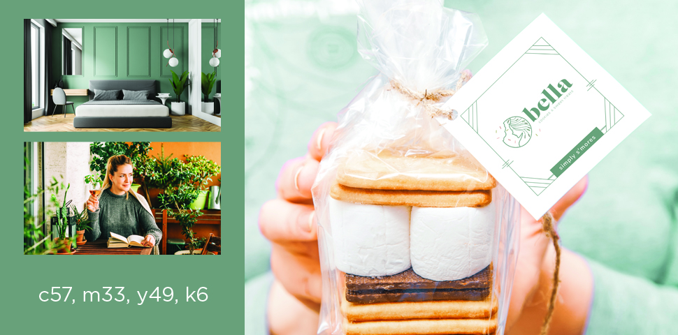
“Green symbolizes health, relaxation, and a rejuvenation of the body and mind. It gives us hope and makes us feel like we have the potential for growth, prosperity, and a bit of luck to go along with it. This sage green embraces the need for these things in the coming year and may offer potential customers a sense of security that you truly care about them and fulfilling their needs.”
-Brooke
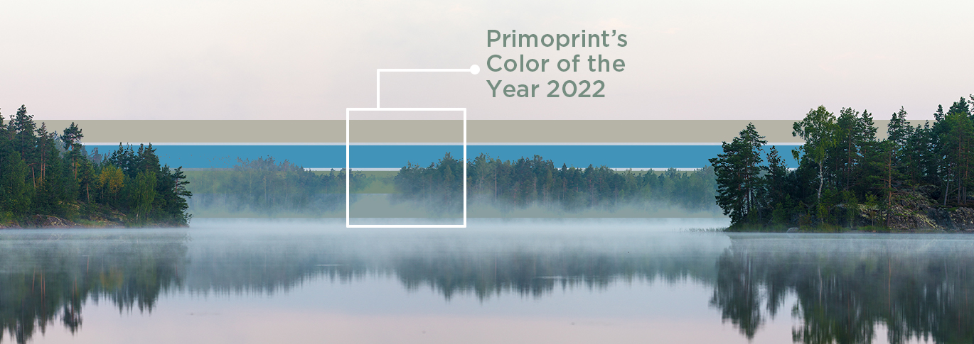
BRENT 76, 30, 1
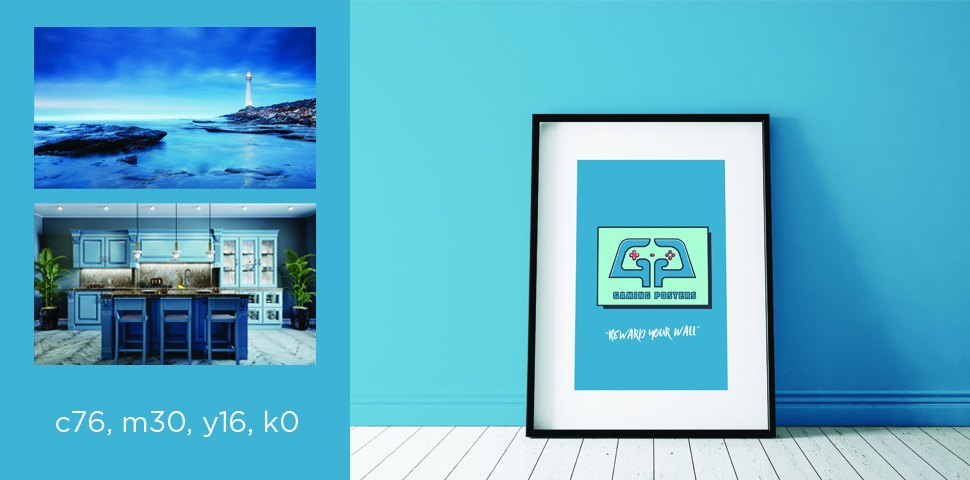
This muted Cyan build invokes a sense of calmness, playfulness, relaxation, and mental clarity which I feel is much needed as we venture into 2022. It can inspire tranquility and creativity when used in any living space or design. I hope to see this color used often in 2022 and beyond. To make the color stand out more, this build is complemented well by subtle darker greens, muted reds, grays, and white.
-Brent
We’d love to know what you think of these colors or if you have your own ideas for 2022’s color of the year. Use #Primoprint on Instagram to show us what you’ve got!
Want to learn more about color and the best ways to incorporate it into your brand? Check out How to Unlock the Power of Color for Your Brand.