It’s that time of year again! The time, as a designer, we mark our calendar and patiently wait for the announcement of the Pantone Color of the Year!
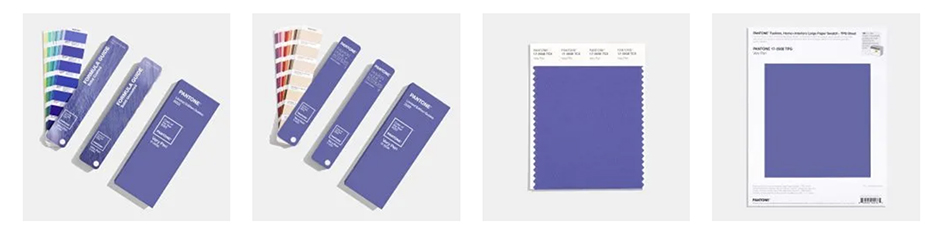
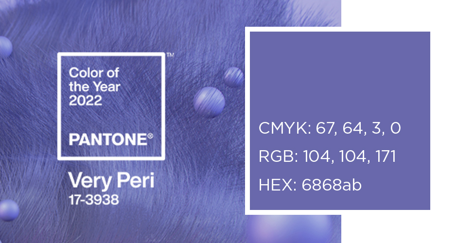
If you are not familiar with this process, Pantone announces every year, since 2000, a special color that they feel represents the world and where we are headed. Everyone from the New York Post to the Today Show, to CNN, and beyond, wait in anticipation to see what Pantone predicts for the upcoming year. This year they have chosen Pantone 17-3938 Very Peri.
Displaying a carefree confidence and a daring curiosity that animates our creative spirit, inquisitive and intriguing PANTONE 17-3938 Very Peri helps us to embrace this altered landscape of possibilities, opening us up to a new vision as we rewrite our lives. – Pantone
From a psychological standpoint, purple represents spirituality, wisdom, and bravery. It tends to make people feel mysterious and imaginative. This blue and red combination is seen very little in nature, so its rareness makes it feel a bit more special.
Fun fact: The color purple became associated with wealth and royalty because most often the rich were the only individuals who could afford such expensive items.
Source: Very Well Mind
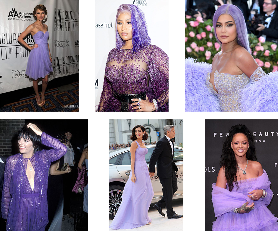
Photo Source: Google Image Search
As we emerge from an intense period of isolation, our notions and standards are changing, and our physical and digital lives have merged in new ways. -Pantone
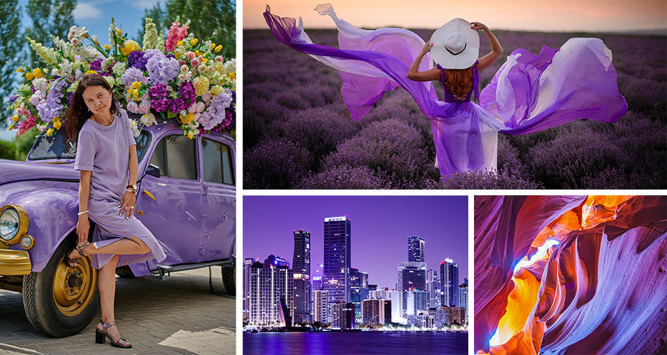
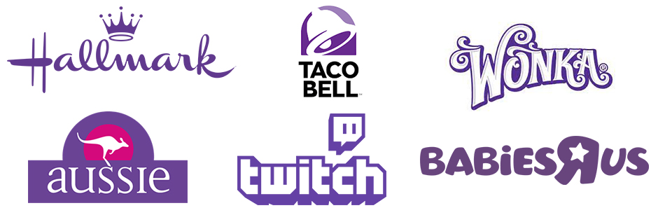
Companies from around the globe are already taking advantage of this beautiful color. But unlike Color of the Year choices from the past, this particular shade of purple is a bit harder to find, making the color a good choice if you’d like to stand out from the crowd.
Very Peri illustrates the fusion of modern life and how color trends in the digital world are being manifested in the physical world and vice versa. – Pantone
If you’d like to achieve this shade of purple but are not able to print with Pantone colors, the color can be closely converted. CMYK and RGB are not able to guarantee an exact match to Pantone, but the color conversion is actually very close.
CMYK: 67, 64, 3, 0
RGB: 104, 104, 171
HEX: 6868ab
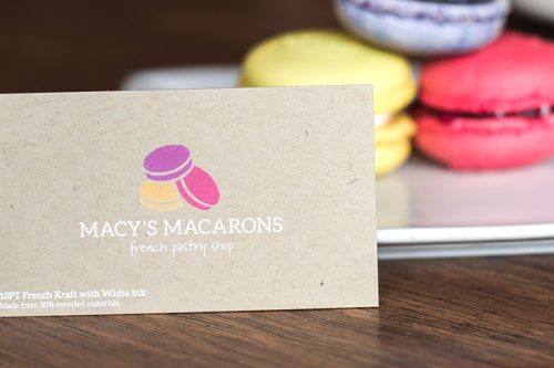
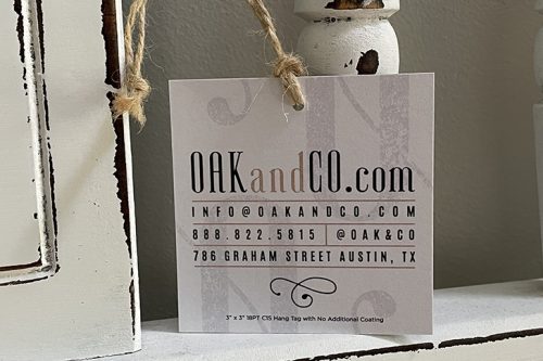
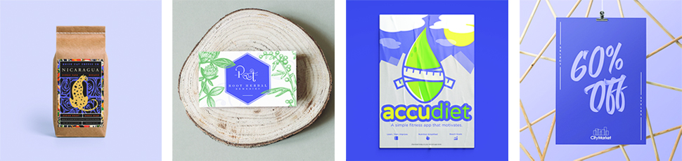
Want to see Very Peri in action? The Primoprint Design Team has incorporated the 2022 Color of the Year in a variety of ways. Whether you are looking for a total purple take-over or want to add simple touches of purple, Very Peri can be a great addition to your design.
If you’d like to see what Very Peri looks like when used in your logo or next marketing piece, then the Primoprint Design Team is here to help. Contact us today to tell us a bit about your project.
We’d love to see how you incorporate Very Peri. Tag us on Instagram so we can take a look! #Primoprint