Gone are the days where the color black rules the world. For many years, black was considered a color of power, and white was a color of tradition. But according to Pantone and recent color trends, the strength lies in color – bright, get-me-noticed color.
Every year, Pantone takes a look at what is going on in the world around us and chooses a color that reflects what they feel is “a color snapshot of what we see taking place in our global culture that serves as an expression of a mood and an attitude.” And every year, they seem to get it right. We start seeing those colors used in not only in graphic design but interior design and fashion.
This year’s “Greenery” symbolizes a new beginning. To me, it represents life, excitement, and growth. Greenery is a bright, earthy green that can be relevant no matter the season. This brings me to spring!

This year, I think we have the opportunity to have a lot of fun with the spring pallet. Sometimes it can be kind of scary to put yourself out there with such bold colors, but I’d encourage you to give it a try.
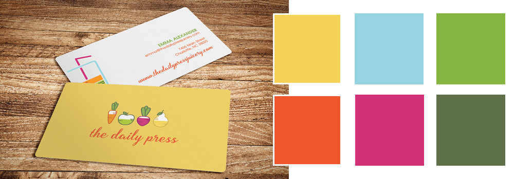
Below are a few color combinations that I created, based on this years Pantone Spring Colors. I’ve kept them very simple, with only three colors per combination. I find so many incredible color pallets online, but when designing pieces, sometimes it’s more realistic (and aesthetically pleasing) to minimize the use of multiple colors.

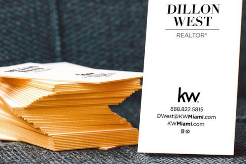
So, how do these colors look in action? Below are two business card designs that our in-house designers have put together, using the Pantone Spring Colors. Each business card design is unique, showing that these new trendy colors will be relevant, no matter the business or subject.

SEE ALSO: How to Unlock the Power of Color for You and Your Brand
There are also a few colors that Pantone didn’t include that I see a lot lately. Below are my selections for trendy colors that may be popping up a little more in the months to come.

Do you have a favorite color combination? Let us know by commenting below.