We know how frustrating it is when you have a job that needs to be printed, but you get errors or emails telling you to fix something before the print order can proceed. At Primoprint, we want you to have the best possible experience with us, so we try to be as thorough with our file review as possible. To help you understand the prepress process, as well as help avoid some extra headaches, we’ve compiled a list of a few of the most common file concerns.
1. File Masks
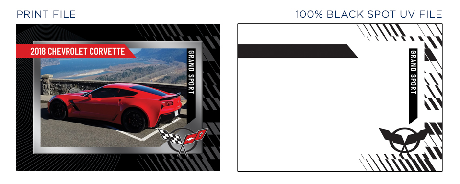
One of the most common file issues are Mask file submissions. These files must be created and submitted in CMYK color mode and can only contain 100% black. This is because our press searches for this pure black value to know where to place the foil or spot uv. If your mask is not 100% black, the system will not read the mask file correctly. All mask files must be created and submitted in vector format.
Learn more about mask creation HERE.
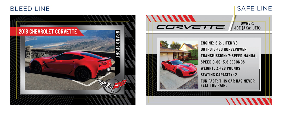
2. Borders
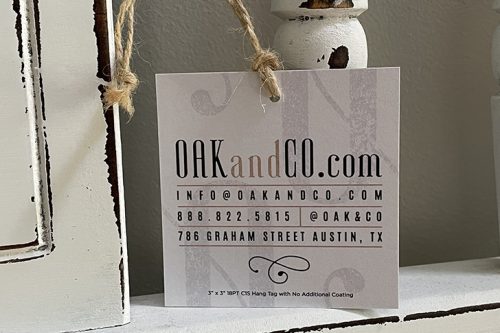
Borders look nice when designed properly, but we often see margins that push the limits of our capabilities. Since there can be a slight shift during printing &/or cutting, which varies depending on the product, we require that border margins be at least larger than the safe area to ensure it will appear on all sides when trimmed. For example, if the safe area is .125” from the bleed edge, the margins should be a minimum of .13”. Keep in mind, however, that the smaller the border margins, the more noticeable the shift. With borders, the larger the margin the less-noticeable any shift would be.
Learn more about shift potential HERE.
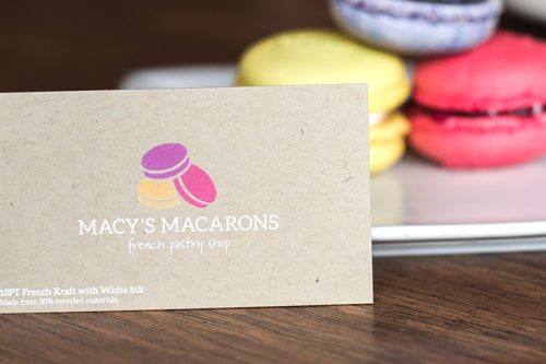
3. Small Text
The use of small text may look good on screen, but using text that is difficult to read when printed defeats the purpose. We do not recommend using point sizes that are smaller than 7-8pt for important information, depending on the font. With script fonts, we do not recommend using point sizes less than 10-12pt, again depending on the font. You don’t want your clients struggling with reading your contact information. Disclaimers can go as small as 5-6pt with standard serif or sans serif fonts.
Learn more about fonts HERE.
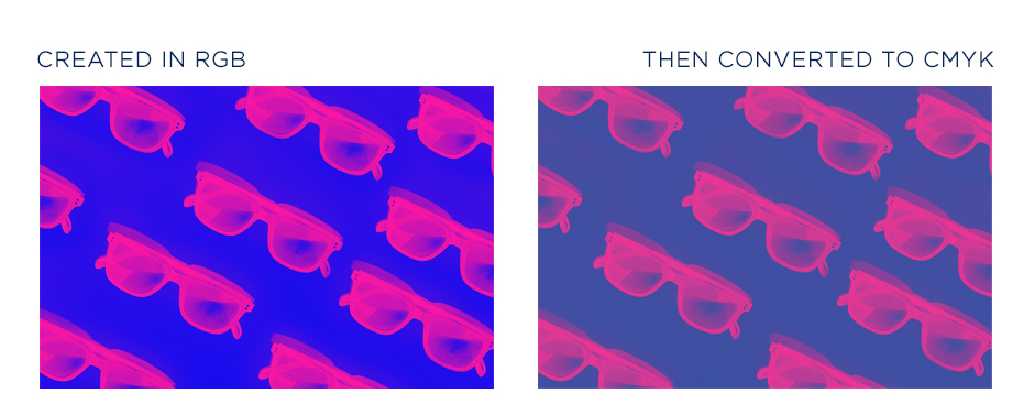
4. Colors Shift
Colors can shift noticeably when converted from RGB to CMYK color modes; most noticeably blues, greens, and grays. For this reason, building your files in CMYK color mode gives you a better idea of how the colors may look when printed, as well as allows you to adjust the colors to avoid these most common color concerns.
Learn more about color CMYK conversions HERE.
The most common color concerns we find are with blues and grays. Blues can tend to look purple if they have too much Magenta in the CMYK build. For the best blue results with 4-color process (CMYK) printing, we recommend that the Cyan content in the build is about 30% higher than the Magenta. For example, if the Cyan content is 90, the Magenta should be around 63. With grays, it is best that black (K) is the dominant color in the CMYK build to avoid a color shift toward blue, pink, yellow, etc.
Learn more about getting the best blue values HERE.
Another common color concern is with black. Oftentimes files are created using default black (75, 68, 67, 90) which is acceptable, but not optimal. Because it only contains 90% black (K90) it can look muddy when printed. The other build often received is 100% black (0,0,0,100) which can appear as more of a dark charcoal due to its lack of saturation. For the best-printed appearance with our processes, we recommend using a Rich Black build of 60,40,40,100.
Learn more about Rich Black HERE.
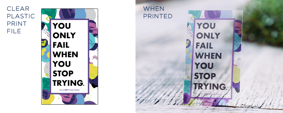
5. Plastic Transparencies
Clear and Frosted stocks offer a cool effect, but designing to print on them can be tricky. Since we do not offer a white ink option, the design will print semi-transparent and the background would be clear or frosted. Generally, text will need to be much larger, brighter, and bolder to have close to the same impact as on a white stock. Even screened effects should be made darker than you would think necessary, as they won’t be solid when printed. It is also not recommended to use QR codes on these stocks. They may not scan properly when printed. We do have the ability to create a mockup of your artwork on these stocks, so if you have a design you’re not sure of, send it over and we can create a mockup before placing your order.
Learn more about printing on plastic HERE.
Again, we know it can be hard printing online, but we want this process to be as easy and seamless for you as possible. It is our policy to double-check all files uploaded for print for any potential concerns that our automated uploader may miss. If we see any errors, don’t worry, we will reach out and let you know. And if you are not able to correct the errors yourself, we have an amazing design team that can assist.
If you have any questions or concerns, we’re happy to help! Feel free to send us an email, give us a call, or start a live chat. We’re not your neighborhood printer, but we do our best to treat you as such.