What is Blurple and How to Avoid it?
Blurple. It’s a funny word that you may hear quite often as you wander through the halls of Primoprint. But what is it and how can it be avoided? Essentially, Blurple is a combination of blue and purple. It’s when a designer sets up their CMYK artwork to be a dark blue, but when it is printed, it looks to be more of a shade of purple. Unfortunately, this can happen quite easily, but with a few small adjustments, it can be avoided.
The Cyan & Magenta Mix
Blue and purple are very close in the CMYK spectrum. Often when people want a beautiful, vibrant blue, they will set their color mixer to have equal, or close to it, amounts of cyan and magenta.
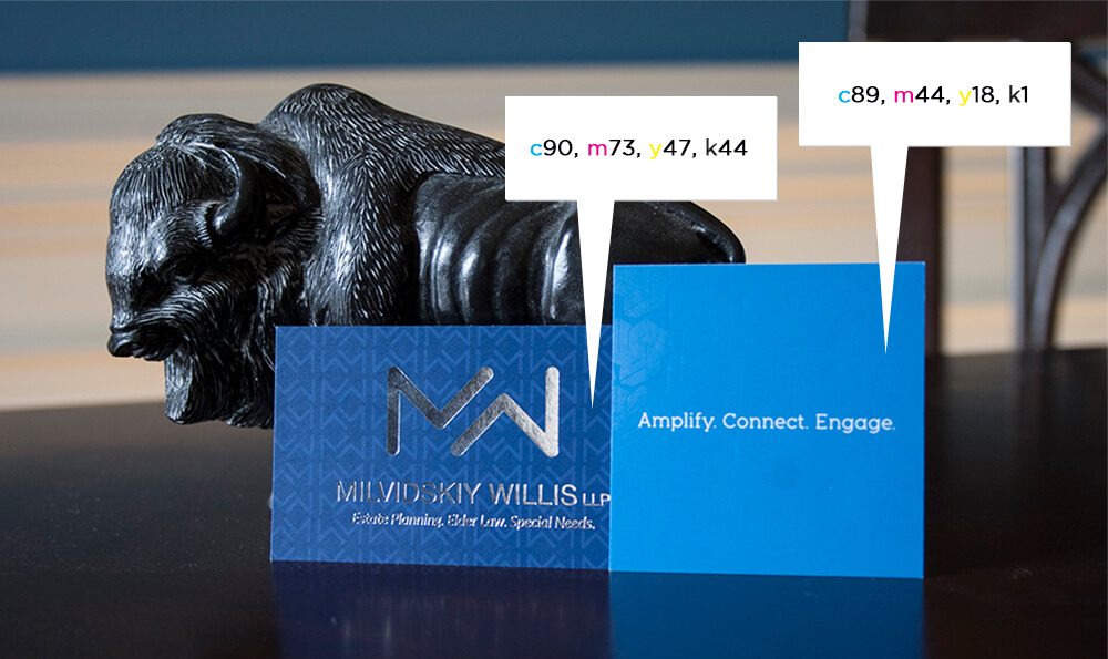
This is where a “Blurple color” can occur. The key is to always have at least a 30% difference in your cyan and magenta values. Adding too much magenta to cyan will result in the color purple even if it appears blue on your screen.
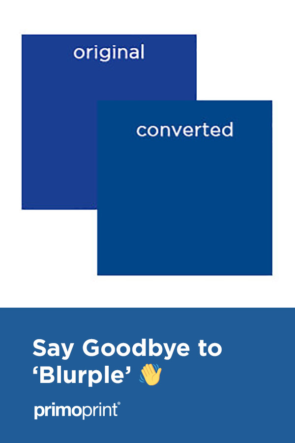
For example, in the image below, the bottom blue could have easily turned purple.
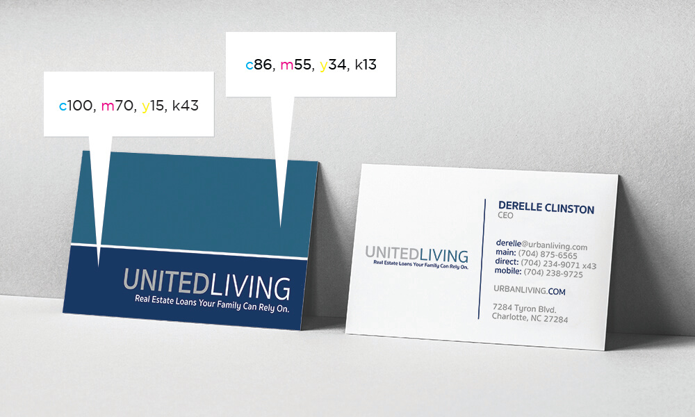
But to avoid that, we dropped the magenta value 30% below the cyan. Most dark blues can be created with this method without the risk of turning purple.
The Fix
As a general rule of thumb or at least a starting place when adjusting your colors, is to add the values you remove from magenta to black.
For example, if your starting color is 100, 87, 0, 7, you would remove 17 from magenta (creating the 30% differential) and add that 17 to the black value giving you a color breakdown of 100, 70, 0, 24.
From there you can move the black up and down a couple of notches to perfect the color. Sometimes the Y (yellow) value will need to be dropped as well in order to get a closer shade. As you can see from the example, it’s not always going to convert seamlessly, but once printed, your blues should look more accurate to your intention than if you had kept the original color breakdown.

Blue is one of our favorite colors, and I love to design with it. As long as you are careful with your values, it should turn out beautifully! And as always… if you have any questions about your color build, or the blurple color, don’t hesitate to ask!
