As we anxiously welcome the Spring of 2022, it may be time to update some of your advertising. It’s no secret that colors can have a physiological effect on your viewers. So updating the way you use color this Spring can have a very positive effect on your bottom line. Using colors that evoke a happier, refreshing time can make people more apt to purchase from you.
Most people think of spring colors as your typical pastels; ones you may find on an easter egg. But in 2022, this traditional rule no longer applies. While you can still get away with those colors, the trends are leaning towards a much bolder, stand-out color pallet. Many designers are also pairing the traditional pastels with brighter colors in order to embody the idea of transformation and uniqueness. In a world bursting with product choices, it’s important to choose colors that help you stand out and evoke an emotional connection to your business.
The fashion industry has hit this right on the head. Half are in calming colors. Obviously, everyone wants to feel they’re in a safe haven. On the other hand, there is the very human proclivity of wanting to get out and be active again. That’s where the more energetic colors come in.
Leatrice Eiseman, Color Psychologist, Executive Director at Pantone Color Institute
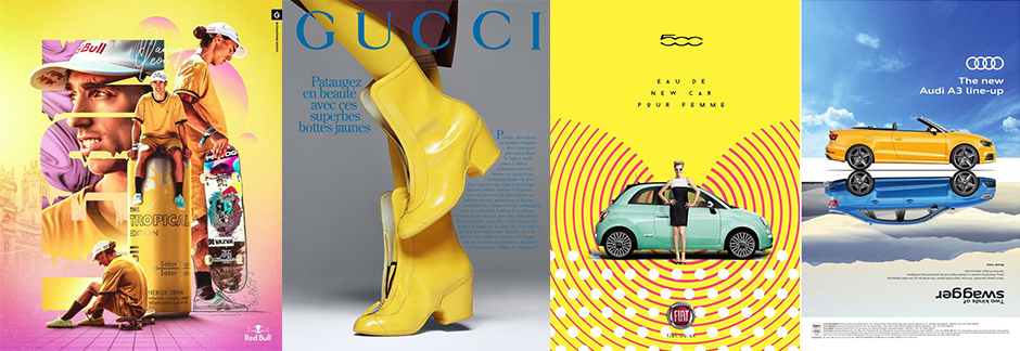
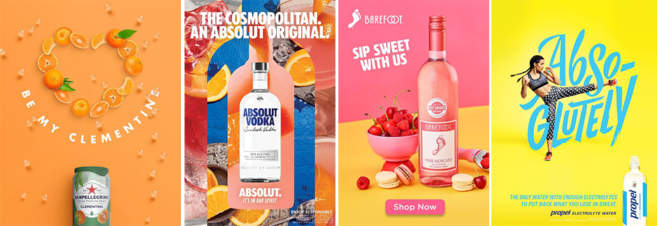
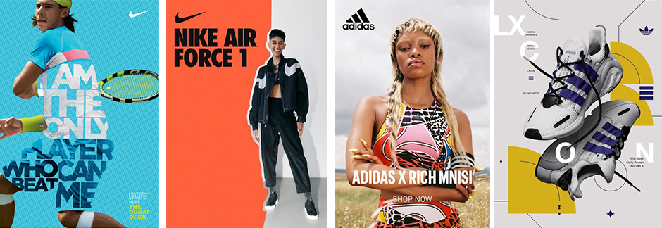
Below are a few examples of brands that have chosen bright, spring color pallets that are sure to get them noticed.
According to Pantone Color Institute experts, colors for Spring/Summer 2022 New York reflect our aspiration for balance as we move through a changing landscape.
Pantone
Brighter colors lift your spirits and let you abandon the rules about color that you learned when you were older. They bring you back to being a kid again and teach you to celebrate something in your life that will give you pleasure.
Leatrice Eiseman
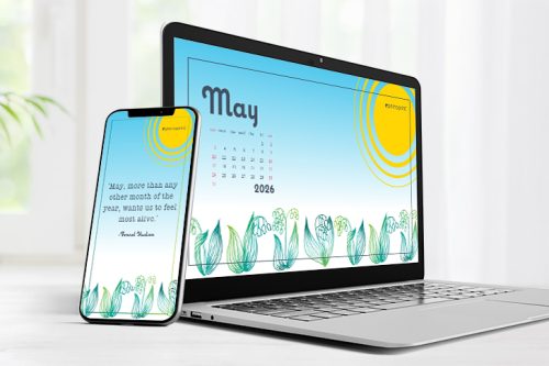
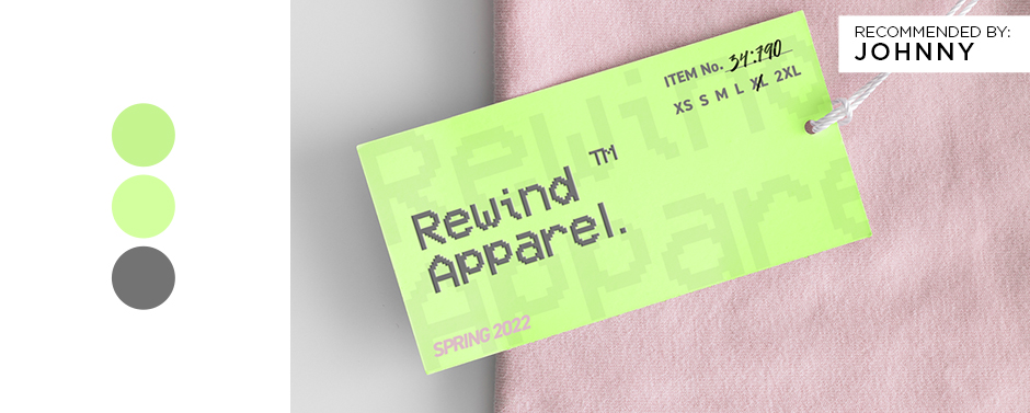
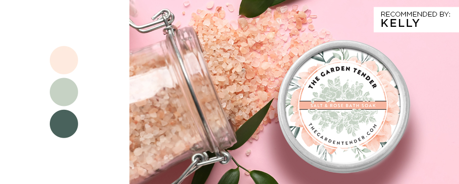
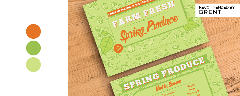
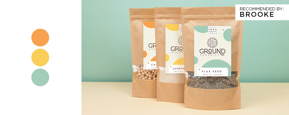
So how can you use this concept for your own designs? The Primoprint Design Team has a few ideas! Below are four examples of recommended spring color pallets for your viewing pleasure.
Need help deciding on which colors are best for your brand? Our team of designers can help build everything from your spring campaign to your one-off flyer. For more design inspiration, check out their Dribbble page. And don’t hesitate to get in touch!