Encountering graphic design is something that happens every day in almost every environment of our life. We scroll through social media posts where targeted ads fight for our attention, or we see a bus plastered in images as we sit in traffic or getting on the subway. Someone hands us their business card inviting a moment of intimacy between us and that design, an internal study we may not always be aware of.
This is the test of the design—what mood, tone, message does it communicate in those first few moments? Some designs are straightforward in their meaning, a what-you-see-is-what-you-get presentation while others dig deeper and get conceptual. Sometimes this involves a hidden message in the logo, or a symbol, an Easter egg that’s like an aha! moment when you get it.
It can be the negative space carving out a shape to create another layer of meaning. Sometimes it’s a suggestion of an image that may add to the subliminal messaging we understand at a subconscious level. It may not be in our conscious awareness, but it can add to our perception of the brand.
Many of these famous logos you see every day and are well-known while others you may be experiencing for the first time.
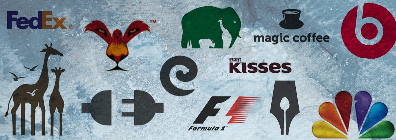
1. FedEx Logo
Probably the most well-known famous logo with a hidden symbol is the FedEx logo, designed in 1994 by Linden Leader & Landor Associates. The white space between the “E” and “X” forms an arrow, reminding us of FedEx’s main purpose—to go, move, deliver.

2. NBC
A3, John J. Graham, and Herb Lubalin of Sudler & Hennessey designed a peacock for the NBC television network in 1986—an abstraction of brightly-colored feathers representing the increase in color programming. The white space in the center forms the head of the peacock, head turned to the right, looking to the future![]()
3. Formula 1
A previous version of the Formula 1 logo, created in 1987 by London based design studio Carter Wong, makes great use of the negative space. Between the black F, which represents strength and determination, and the red motion lines or the “passion”, is the “1” in Formula 1. Once you see it you can’t unsee it.

4. Baskin Robbins
In between the B and the R of the Baskin Robbins’ logo, formed by partially recycled bits of those initials appears the number 31 in pink, standing for the ice cream chain’s famous 31 flavors.
5. Hershey’s Kisses
Everyone knows what a Hershey’s Kiss looks like and the designer of the logo cleverly placed the motif as an Easter egg, snuggled between the “K” and the “I” in Kisses”. Who couldn’t use an extra piece of chocolate?

6. Kölner Zoo
An elephant is the main subject of the Kölner Zoo logo in Germany, but hidden in negative spaces lurk a rhinoceros and giraffe. The area between the elephant’s back legs represents the twin spires of the nearby Cologne Cathedral.

7. The Bronx Zoo
The Bronx Zoo logo, designed by Caroline Madigan, features birds and two giraffes with the iconic New York City skyline for its legs. The zoo is the largest in North America and one of the largest in the world.

8. Beats
The logo for Beats was designed by ammunition, a branding agency in San Francisco. Its minimalist design features a red circle which isn’t just a circle but also a human head. The lowercase “b” doubles as headphones. Simple, and yet much more complex than it first appears.

9. Magic Coffee
Leo, a Lithuanian-based graphic designer, designs inspire on the deeper level we’re talking about. When you first look at Magic Coffee’s logo you will probably see the cup of coffee first, and moments later the top hat. Or perhaps the other way around. Either way, it’s magic.

10. LION BIRD
This beautiful logo for Lion Bird was created by Nashifan and simultaneously transmits the singular image of a lion and a bird.

11. ED’S ELECTRIC
Siah Design Inc. created the logo for Ed’s Electric. Simplicity is still electrifying.

12. The Guild of Food Writers
300million in the UK designed The Guild of Food Writers logo. Another full use of positive and negative space—waste not, want not.

13. Elefont
LogoMotive’s Mike Erickson designed this clever visual and auditory amalgamation of elephant and font.

Were you surprised by any of the popular logos mentioned above? Next time you see a logo, see if there is a hidden meaning or message.
Which is your favorite brand logo? Do you have any logos you find to be interesting? Please share them below!