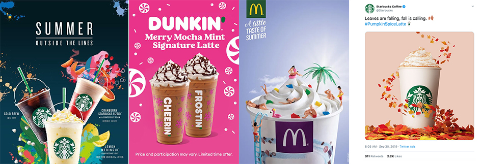
As the seasons change, many companies will choose to alter their secondary color pallets to accommodate the time of year and how we feel during that period. During the holidays, for example, you may see a lot more red and green. And during the summer, you may see a lot more yellows and pinks. But the question remains, is that the best action from a marketing strategy? Or should businesses play it safe and stick to their branded colors?
On one hand, it’s important that companies stay consistent with their colors in order to help support their brand. Achieving brand recognition is essential in the longevity of a company. Even small alterations in color can confuse the audience and lose the brand identity. Imagine if Target’s red was more of a burgundy. Or if Starbucks was suddenly teal. As a consumer, we may lose trust in the brand if they continually change how we see it.
But it’s no secret that colors evict emotion. And emotion makes people connect or disconnect to your brand.
How a brand makes a person “feel” will impact what a person buys 1.5 times more than any other factor.
According to RetailCustomerExperience.com
So making sure you are able to create an emotional connection to your audience is essential.
As seasons change, the way we as businesses are able to speak to customers can change. For example, during December, brands can entice customers by incorporating Christmas and other winter symbols into their marketing material. People’s frame of mind is about staying warm, decorating the Christmas tree, and giving presents. So it makes sense for brands to incorporate these tones into their displays and advertisements. This plays on the memories and emotions that the consumer is already feeling.
In addition to color exemplifying emotion, color is also a form of communication. It’s a way to create a shortcut in how to communicate your message since our brains are already searching for the change in seasons – again creating a way for your audience to latch on to your brand.
Interestingly, how a person feels about a color (positive or negative) can change throughout the year too. (According to NPR.com) So using colors that appeal to people in that particular season can be beneficial.
So where is the balance between staying true to your brand and appealing to a customers changing views of colors throughout the seasons? The key is all in moderation. You can easily keep your set branding and add small pops of seasonal colors, rather than going completely off the branded colors you have established. While there are exceptions to every rule, start by keeping your logo the same color and other branded elements intact and introducing small elements that suggest the change in season.

Keep in mind that when you change the colors in your advertising, you can change what your customers expect from you. So make sure any color changes project the emotion and communication you want your customers to feel. For example, if you own a cleaning company, I wouldn’t start to use a lot of browns during the fall season. This takes away from your business model which is to represent “clean”.

As the summer months are upon us, take a minute to really think about how your business relates to the feeling of summer. Then decide what colors represent that feeling. And then which ones coordinate with your brand the best? Lastly, think about how those colors can be incorporated into your advertising strategy. Sometimes you can make it obvious by changing your background colors and adding bright colorful graphics. But you can also add the color in more subtle ways too. Maybe your model is wearing a pink or yellow shirt. Maybe the props in the background include the summer tones you are going after. These small details can end up making a big impact on your viewer subconsciously and allows you to create your summer-feel without going too far away from your brand.