The question is, why white space is so important? For years, everyone believed that the more content you placed on a web page, the higher your rankings in search would be. Many websites believed this to mean that you pile in content and hope for the best.
However, what actually helps a site rank faster is its readability, design, and authority. In the same vein, who is going to share a page that is difficult to understand? It’s hard to read a jumbled mess, especially if it lacks white space.
What is White Space?
In web and print design, white space is exactly what it sounds like. It’s the space between the lines and around the images. White space frames your pages so you can see different UI elements, content blocks, and so forth.
However, white space does not have to be white. What if your web page has a dark palette with a black background?
White space means that as you compose a design, you are also thinking about how to organize and isolate elements on the page to make them more meaningful. Without this space, your designs may come across messy and difficult to peruse.
But If I Have Good Content, Does White Space Still Matter?
To this day, white space is integral to any design. When you use white space correctly, you can transform a design into an iconic piece of work that informs, highlights, and entertains. This is because each element has its own space framed by the “silence” (white space) of the page.
There are some other things to consider when designing with white space:
1. Easy-to-Consume Designs
Print and web design use white space or negative space the same way. Designs have to be easy to understand in an instant. With print design, graphics and white space must balance out cohesively.
Today’s online users view pages in a second and bounce off just as quickly if it’s not something that they want to read.
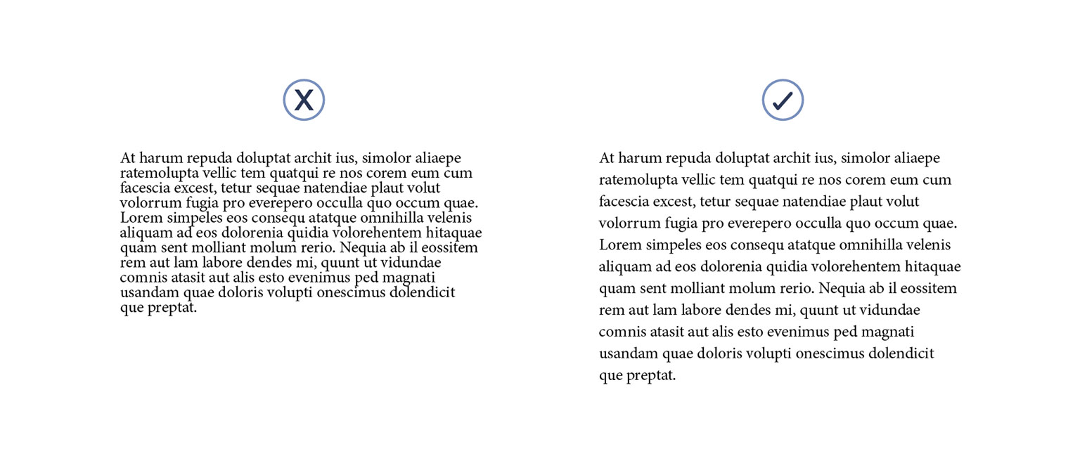
White space helps you improve that legibility and readership. This means adding lines of white space between paragraphs, changing margins, and blocking out important images.
2. Attention Here, Please
White space also calls attention to more important aspects of your design. Designers block out important images with a decent amount of white space, or perhaps they use a full-width image followed by a paragraph in the middle with large left and right margins.
This makes the reader focus on the image and the text.
Apple is probably the most notable brand for using white space in their web design and graphic advertisements. The iconic MacBook design on a white background, tilted with a shadow with just its name printed above it.
This image is surrounded in white space to keep the focus on the color, texture, and branding of the computer.
Other Brands to Look at:
Just Google some of these common brands with the phrase “[brand name] + white space design”:
- Volkswagen
- Land Rover
- Fender
- Southwest
- Coca-Cola
- Beats Audio
When looking at these ads, note how iconic the product’s shape and font selection is. Colors also matter as you want to be able to show dimension and sharpness to further increase the power of your image.
3. Highlight CTAs
A CTA is a call-to-action that you can highlight using white space. The average attention span of Internet users these days is quite low. In fact, recent studies revealed that even a 1-second delay on the loading of your page will mean a loss of readership.
So what can you do as a designer to increase interaction? You can use white space to get directly to the message and CTA. The CTA is typically a phrase with a button. You may see it at the top, inside of an image as a button labeled “Sign Up.” The CTA is meant to direct the reader’s attention to what you want them to do the most, however.
For some websites, it may be a buy button. For others, it may be a short form. Whatever this CTA element is, it’s important that you highlight it and call attention to what you want the reader to do.
4. The Law of Proximity
This simply means, how close are elements to each other? If you have a set of icons together, do you have them wide enough from one another to allow for logical grouping for the user?
This helps with your organization of the page. With some designs, if images are too close to one another, it can look like one giant image instead of logical groups.
The proximity of the white space can be greater in order to separate images and allow users to consider each as its own bit of information. When you do any type of grid design, it’s important to use white space to make sure people can see the differences in each symbol, icon, or image.
5. Breathable Designs
Have you ever looked at a design and not known what to look at first? Nothing stands out in these type of designs except for possibly the CTA, but what if you wanted to have a significant headline with a supporting tagline?
The headline is meant to evoke a feeling, while the tagline below should support and explain for readers who are more interested. If both of these elements have the same size and white space, it comes off as a block of text.
Breathable designs play with font size and white space to make it more readable down the page. Your design is more fluid and easily goes from one element to the next, making each easy to visualize for the reader.
This is important to keep in mind when designing for smaller spaces like business cards and mobile applications.

6. Set the Tone of Your Brand Design
White space can also be explained in terms of micro and macro. With a micro white space, you are looking at the separation between lines of text, which is important for magazines and newspapers.
However, websites like to use macro white spaces because it gives the user a sense of refined luxury. If you think about Apple’s design, for example, you notice all of the shine in the logo and the crispness of its shape on a white background.
7. Don’t Go Overboard with White
It’s as simple as that. While using a sensible amount of white space is one thing, there may be some products or clients that require more text and need organized complex designs.
Can you mess up a white space design? While more white space doesn’t necessarily hurt a design, you can have wasted space. You want to make sure that your designs are utilizing space so that it is effective and valuable.
If you have clients who expect a top-quality design but don’t understand white space, you may also have to explain what your design is doing and prove that it will work.
