In 2000, the Pantone Color Institute began creating the Pantone Color of the Year. This color is a trendsetter for branding, marketing, and design for the upcoming year. Pantone seeks inspiration from around the world, including fashion, entertainment, new technology, marketing, social media, politics, and socio-economic conditions to determine the color.
Why is the Pantone Color of the Year so important?
The highly researched color highlights the relationship between trends in color and what is taking place in our global culture. Psychologically, color has always been examined and placed in categories according to the emotion it inflicts.
If we know how a vast majority of the world is feeling, we as designers/advertisers can appeal to the larger crowd. The color of the year reflects what individuals feel they need, so it can help guide our designs in providing the answers consumers are looking for.
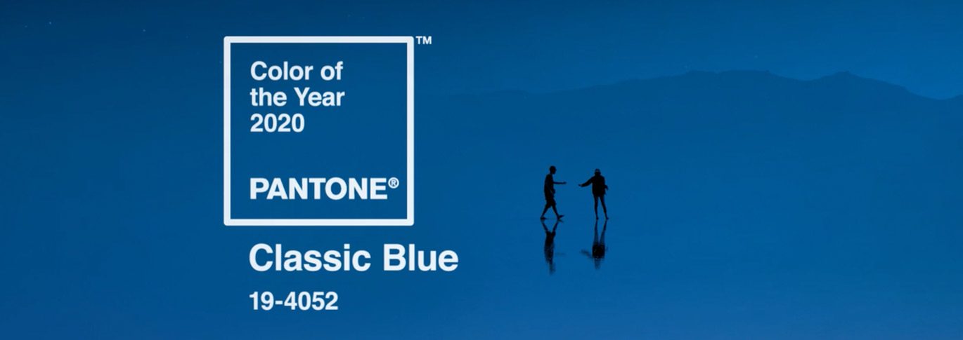
This year, Pantone Color Institute has chosen PANTONE 19-4052 Classic Blue as the 2020 Color of the Year.

The color blue has always been a very popular branding color. We get more requests for blue-hued logos over any other color by far.

Blue is most often associated with depth and stability. It symbolizes trust, loyalty, wisdom, confidence, intelligence, faith, and truth. Blue is both beneficial to the mind and body, so it’s no wonder so many companies insist on using it. Global brands like Intel, GM, PayPal, Visa, and Facebook all use a similar shade.

How Can You Use It?
We don’t suggest that you re-brand your company each year to correspond with the Pantone Color of the Year. However, incorporating accents of blue into social media posts, print, and online ads can appeal to your audience.
Are you launching a new product? Painting the walls of your office? These are both excellent times to take advantage of the color as well.
What About CMYK?
Many printers, like us, do not print with Pantone inks. Instead, we use the four-color process called CMYK. It uses Cyan, Magenta, Yellow, and Black ink combinations to create each color. If you want to use this Pantone color, but prefer the benefits of CMYK, you can easily convert the blue.
I recommend using the CMYK breakdown of 97, 70, 12, 20. This color conversion is extremely close and also ensures that the print will be a purer blue, rather than tinting purple.
How will you incorporate the Pantone Color of The Year into your year? We’d love to hear! Comment below to share your ideas.