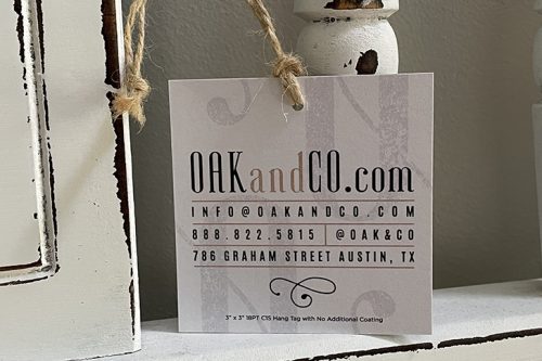
As a designer, I’m continually having customers tell me that they want a card that “pops.” Some people may think that means they want a card that is a bright neon color and that jumps out at you. But I have come to understand that people, in general, want a card that stands out from the crowd. And how you achieve that, is not always the way one might think.
If you want your custom business card to really “pop”, there are a few do’s and don’ts to keep in mind.
We recently revisted this important topic on how to design a business card and making it an effective visual marketing tool. Below are our top business card design tips.
First and Most Important, Keep it Simple
The more information you have on a card, the harder it is to
- Find what you are looking for.
- Figure out the best way to reach you.
Limit Your Phone Numbers
Phone numbers, for example, are one way to simplify your card. How do you want your customer to call you? The main office? Your receptionist? Your cell phone? Why not direct all of your calls to one place? It’s a lot easier to determine where to call when you only give them one option. And how often do you use your fax machine? If very few of your customers actually fax you something, maybe consider leaving that off too. If they need it, they’ll ask for it.
Your Physical Address
Do you have a business where you want people dropping in? If not, maybe it’s best to leave that off as well. At Primoprint, all of our business is done online, with companies all over the world. Very seldom do we have people who come into our physical offices. So there is no need for us to include our mailing address on our new cards.
Social Media
Social media has created a whole new world for communicating with customers. Letting people know which sites you are on can be important, but consider using the sites logo icon, rather than spelling out your entire handle. These sites have made it really simple for people to type in your name and find you.
High-Resolution Logo
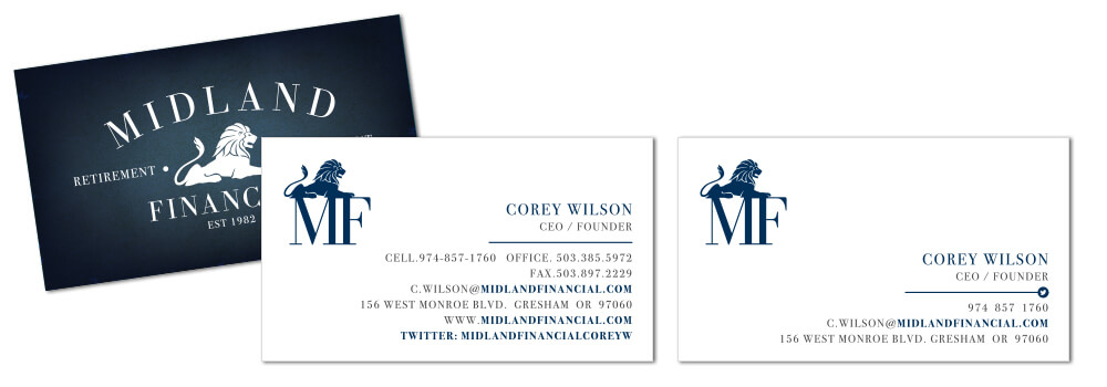
Sell yourself right with a high-resolution version of your logo. I’ve seen companies that appear to cut and paste their logo from a scan and then try to use it on their cards. Unfortunately, that will not print well and doesn’t make your company look very professional. If you don’t have a high-res file, consider hiring a graphic designer to recreate it for you. Most of the time this is a simple process and will be a lot cheaper than designing a new one from scratch.
We know if can be challenging to find high-resolution images for your design. Take a look at the top 28 websites that offer free stock photos and select an eye catching image.
Make Sure You Smile!
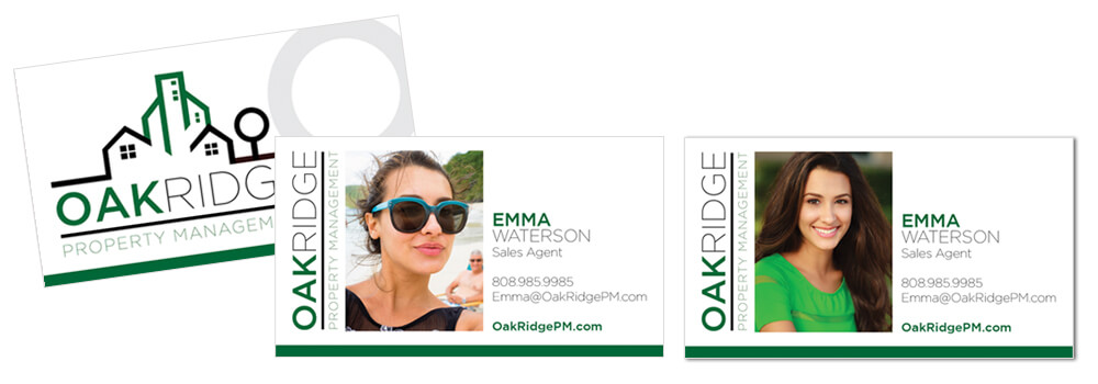
If you want to use a photo on your card, I recommend hiring a professional photographer to take it. Selfies are great for Facebook, not so much for your card. Put yourself in the best light with a beautiful photo, that was taken at a high resolution, by someone who knows how to make you look good! We’ve met with our in-house photographer and she provided us with six helpful tips on how to take better headshots for your professional business cards.
Check Your Fonts
There are a million “cool” and “funky” fonts out there. In every style, you can imagine. With a business card design, try to keep your fonts very basic. These are easier to read. It should complement your logo, but not have a robust stylistic feel to them. And make sure your font is large enough for people to understand. Small type always looks better, but depending on your clientele you may need to keep it a little more substantial.
Still, Need More “Pop”?
If you’ve followed all the suggestions above and still would like to see additional “pop” you may want to consider thinking about the finish and paper type you are printing on. Adding elements of Spot UV or Stamped Foil can really elevate your business card to a new level.
But again, these elements should complement your design, not over-power it.
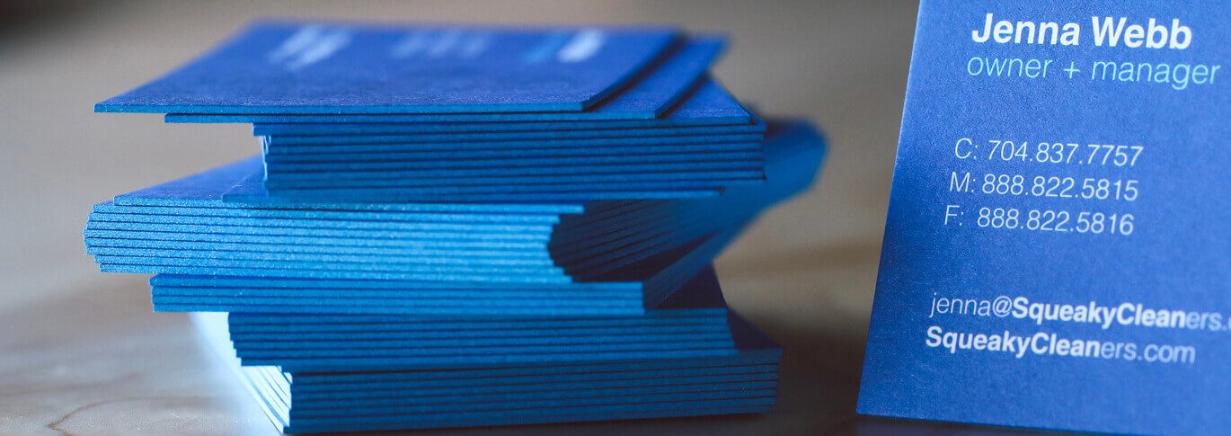
Also, consider upgrading your paper. Matte, Glossy, and Uncoated are pretty common paper types. If you want your card to not only look different but also feel different, try printing on a soft-touch paper, such as our Velvet. Or, go with a super thick, 32PT Uncoated card. You can even choose one of 17 colors to cover the edge of the card. These specialty papers and additional print processes can bring your design from great to amazing!
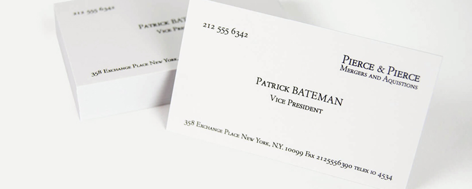
Our graphic design team designed the Patrick Bateman business card printed on Velvet card stock. “That’s bone. And the lettering is something called Silian Grail.”
As with any custom design, the look of the card is very personal and subjective. What I like, you may not. And what works for my business may not work for yours. So find other cards that you desire and figure out what it is about those cards that make it successful. And if you need help, don’t be afraid to ask. The designers here at Primoprint would love to help you out!
Choosing the Card Stock
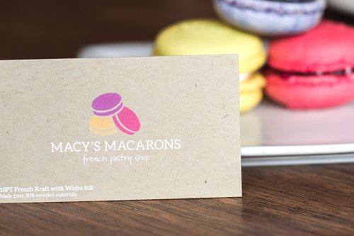
Why is it essential to select the right card stock? Well, it’s all about the impression you want to deliver. Plus, it’s about how you want to tell your brand and a story. Additionally, card stock can represent a personality. For example, for those individuals that are looking for eco-friendly card stock, they would select Natural or Kraft paper stock. Both contain 30% of recycled materials.
Resource: YouTube Product Videos
Picking the right card stock plays an essential role in the available features. For example, Spot UV is only available on a few types of card stock, including Silk, Velvet, and Matte. It’s not available on Natural or Kraft paper as an example.
Card Stock Thickness
At Primoprint, we offer a large selection of card stock thickness options. Choose from the following options; 14PT, 16PT, 22PT, and 32PT, which is our thickest card stock. The below image is based on 100 cards. Depending on the use, a standard business card thickness of 16PT is sufficient for most features.
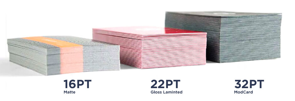
Resource: Paper Stocks and Weights
Additional Resources:
- 5 Tips for Using Business Cards Effectively:
We’ve listed 5 tips on how to use your business cards effectively. From handing them out to creating a custom design. - 13 Unique Ways to use Business Cards:
Business cards are super affordable and can be used in a variety of ways. Learn creative and fun ways to use these small, but powerful 2 x 3.5 cards!
