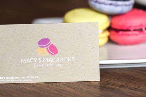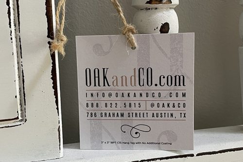
In communication, it is important is to establish an effective typographic hierarchy. According to the educational website lynda.com, “typographic hierarchy is the way type is organized in order to indicate levels of importance to the view.”
Through this particular organizational system, one is able to combine both typographic and spatial elements to create the desired effect. In mixing different sizes, weights, and fonts in typeface or incorporating drastic colors or white space, one can impact a copy’s readability and usefulness.
“Make it simple, but significant.” –Don Draper
What is Typography?
Typography is defined as a visual component if a written word. You can learn more about the meaning of typography.
What does it mean in graphic design? Well, there are three levels of typography hierarchy that are used to create an effective hierarchy.
- Level One: This is viewed as the most important content or information: this should be the most prominent typographic element in your design.
- Level Two: Generally, these elements help organize your design into sections or help group similar information together. While it shouldn’t stand out as much as your Level 1 type, it should clearly guide viewers through the different parts of the design.
- Level Three: When you have a text-heavy layout, this level of typography is typically the meat of the design. This is the copywriting text, where you get into your design’s message. Level 3 can vary in length—from a couple of paragraphs to a brief description; the primary concern is to ensure the content is easy to read as the font will be smaller.

In establishing typographic hierarchy, weight and typefaces are essential, particularly for headlines or subheads. In addition to decorative and bold typefaces, a very light typeface can also draw attention in the right setting.
Type Size
The viewer’s eye is first captivated by the largest-size type and then continues to other elements. With three levels of typography, the font size generally starts out biggest at the top (Level One), and it decreases in size as you move down the page. Since we read from left to right and top to bottom, the top-to-bottom hierarchy is the most natural way for readers to navigate information.
Color
Using color either attracts attention or de-emphasizes an element. Because colors carry their meanings and associations, make sure that your color selection matches your brand and design purpose. Remember, overuse of color can create visual confusion, which will undermine its effectiveness.
Case
Using capitalization sparingly can be an effective way to capture one’s attention and show importance, especially in headings or subheadings. However, all caps can be detrimental to readability, so using traditional uppercase and lowercase is preferable for lengthier text.
Placement and Setting
The placement of every element as well as the kerning, or space between and around them, is part of the overall hierarchy. Make sure to keep the most critical information prominent. Place all related elements together and visually separate others to organize and structure the content.
Alignment
The way in which you align elements implies their relative level of significance. For example, centering conveys a sense of importance; most commonly used for titles, invitations, headlines, and announcements. On the other hand, running body copy generally calls for less focus than headings and subheadings; this is why is it usually set flush left, making it easier to read and comprehend.
White Space
Using negative or white space can create emphasis and draw attention to key content and elements. It is best not to overload every inch of space on a page because that can create excessive “visual noise,” fatiguing or be confusing the reader.
An effective design offers visual clues to guide the observer through the content. Successful typographic hierarchy is crucial to communicating the intended message and maximizing the chances of the content being read and comprehended.