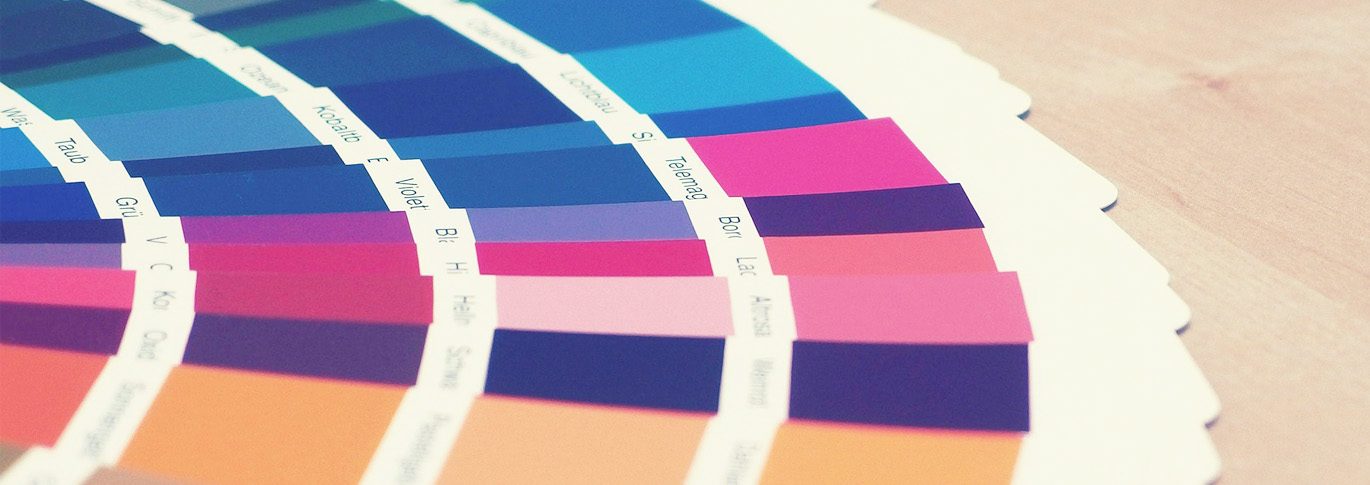
Pantone has given us the Classic Blue as our color for 2020. It is an eye-catching and versatile shade! With the vast options for color, many others will make their way to the forefront this year as a trendy color.
Below, each of the Primoprint designers has chosen their 2020 Color Of The Year and has explained why they think that color will pop up more and more as the year goes on.

I’m seeing a lot of “futuristic” compositions and neon palettes in both fashion and digital design. – Kelly, Graphic Designer
“Ironically, there also seems to be increasing interest in a more vintage aesthetic and jewel tones – particularly in fashion and interior decor. I think this amped-up honey color has its place in both camps. It’s vibrant enough to fly off the page or runway and inviting enough to use as an accent color in your home. – Kelly, Graphic Designer

I’ve seen variations of this green-blue-gray hue a lot lately. – Liza, Graphic Designer
“How it appears will always depend on how it is used, but I see it as earthy, elegant, and sophisticated. It has calming qualities because of the blue and is reminiscent of nature. I think this color will be on the rise this year since the welfare of our Earth is on our minds. This color is grounding and represents stability, which is something 2020 can benefit from.” -Liza, Graphic Designer

I chose this color because I feel that it will add warmth and sophistication to the focal point of your design. – Brent, Graphic Designer
“This muted red was inspired by the artwork and Art Deco design of the 1920s. Since we are now back in the ’20s, I hope to see more themed pallets from the 1920s era used in contemporary designs in the coming decade.” -Brent, Graphic Designer

I think this color will be very popular in print because it’s very subtle and very calming. – Cindy, Graphic Designer
“It invokes the beach and provides a great backdrop for showcasing other natural, earthy colors for contrast.” -Cindy, Graphic Designer

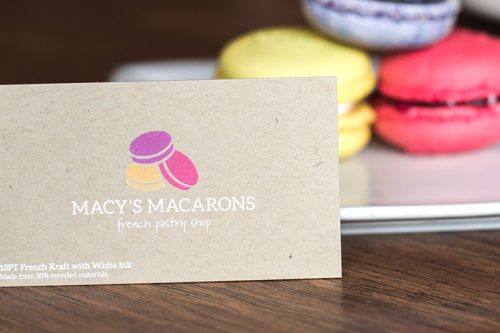
My personal 2020 color is white (0, 0, 0, 0). – Brooke, Graphic Designer
“Ironic right… since it’s considered a lack of all color?! In years past customers always looked for black business cards. To many, a black business card symbolized power and luxury. I think people realize that you don’t need to have black artwork to establish sophistication. In a world of so much chaos, keeping things clean and simple seem to be the way people are looking to go. White signifies purity and perfection. Keeping your business card designs simple with lots of white space can stand out in our busy world.” Brooke, Director of Design
Need help with your designs or determining your company colors? We’d love to help. Contact us today to discuss all of your design needs!